Menu
healthy growth
 Share
ShareAn integrated website platform for Tāmaki Health
Tāmaki Health is New Zealand’s largest independent primary healthcare group. Fiercely passionate about community, healthcare and people, husband and wife team Kantilal and Ranjna Patel opened East Tāmaki Healthcare in the 1970s.
This small GP clinic in Ōtara grew into the most visionary healthcare company in New Zealand. Across New Zealand, 45 clinics are now providing all New Zealanders with quality and accessible health care no matter their creed, ethnicity or financial position.
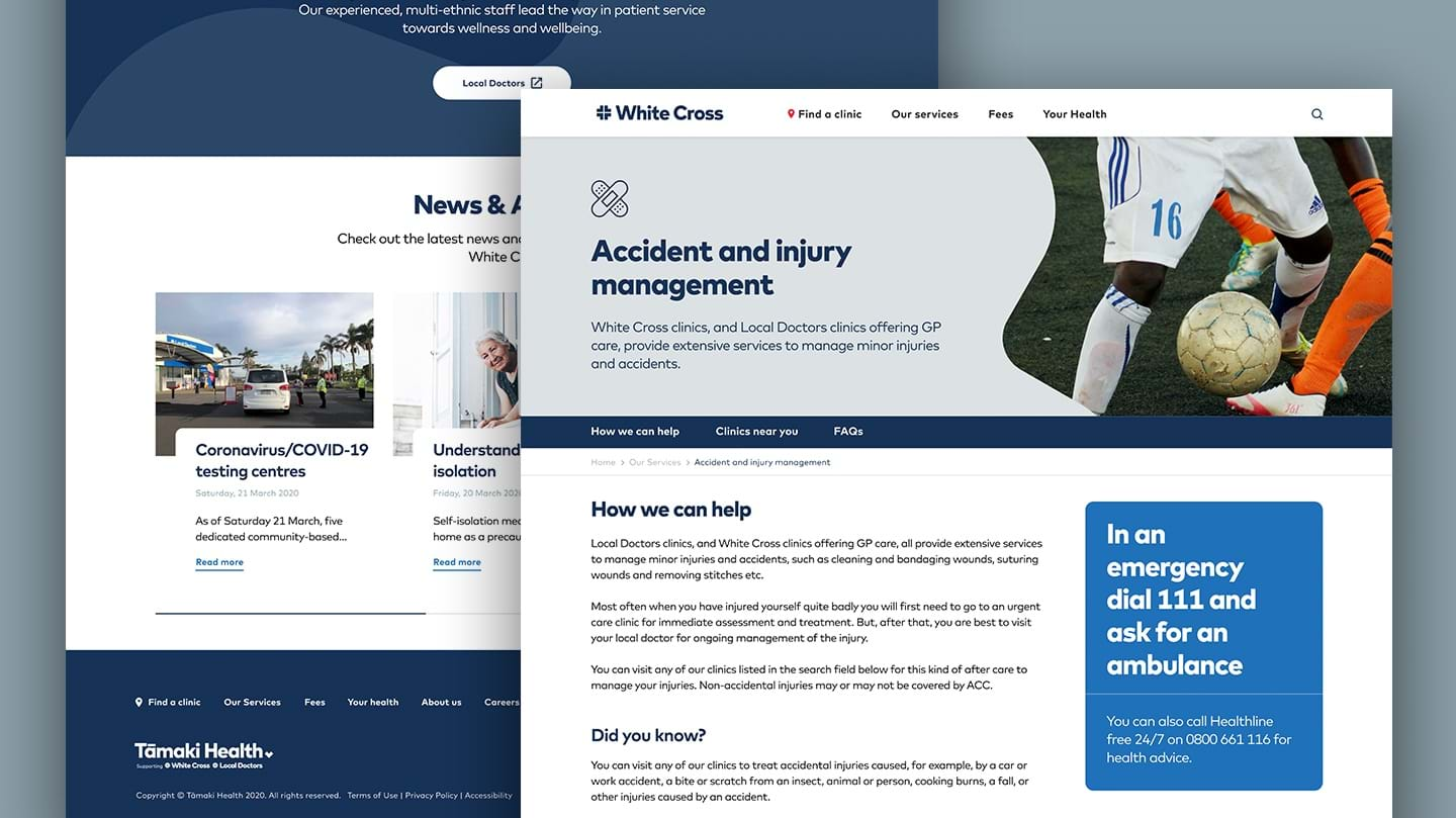
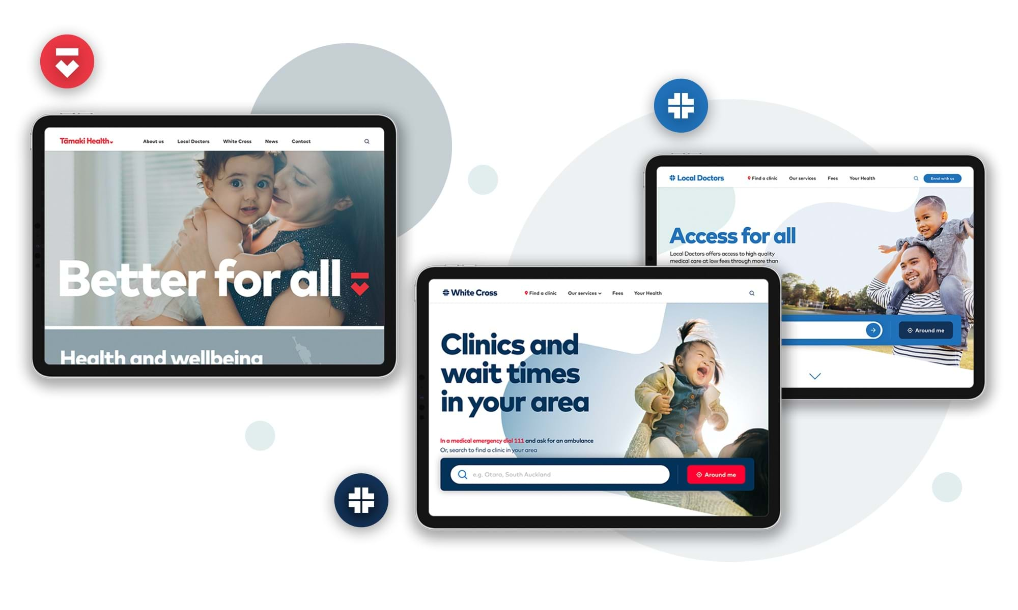
Two medical clinic networks - Local Doctors and White Cross - continue to deliver on the philosophy the East Tāmaki Healthcare founders’ had. These sibling brands, part of the same family, with one strong heart - are now called Tāmaki Health. Proud yet humble, the Patel family have ensured that at every stage of growth their values were never compromised.
As the healthcare requirements of New Zealand’s diverse and growing communities change, Tāmaki Health provides the best in medical services for all. They do this through investing heavily in technology and leading the charge in communities by building awareness around wellness and preventative health as well as managing long-term conditions.
Tāmaki Health did not have a digital marketing or strategy across the group. They were embarking on the first steps in their digital journey to support their business objectives. Whilst the two sibling brands of Local Doctors and White Cross had their own websites, they functioned as simple information and contact detail repositories with no defined objectives or KPIs. The reimagined digital presence needed to considerably expand the functionality and enhance the user experience for greater patient satisfaction.
The websites needed to act as a place where both prospective and existing patients could instantly transition from being anxious to feeling calm and relaxed.
Delivering a Connected Solution That Spans Three Brands
The project required us to meet the individual needs of the family of brands, each serving a different purpose. The parent brand - Tāmaki Health - required a website that acted as a place of discovery for investors and practice owners looking to support and join the group.
Leading with a strategic approach to UX
A core reason for the client’s engagement with us was to start the process of developing a digital strategy that supported the wider business objectives.
It was clear from the start that the project was more than just a short term website development. We considered what a two to three year digital roadmap could look like, and built our approach on a scalable ‘future-proof’ website framework. It was important to create a data-led, user first digital strategy that would help Tāmaki Health develop a market defining experience to stand out amongst the competition and support their ambition to be identified for excellence, both online as well as in practice.
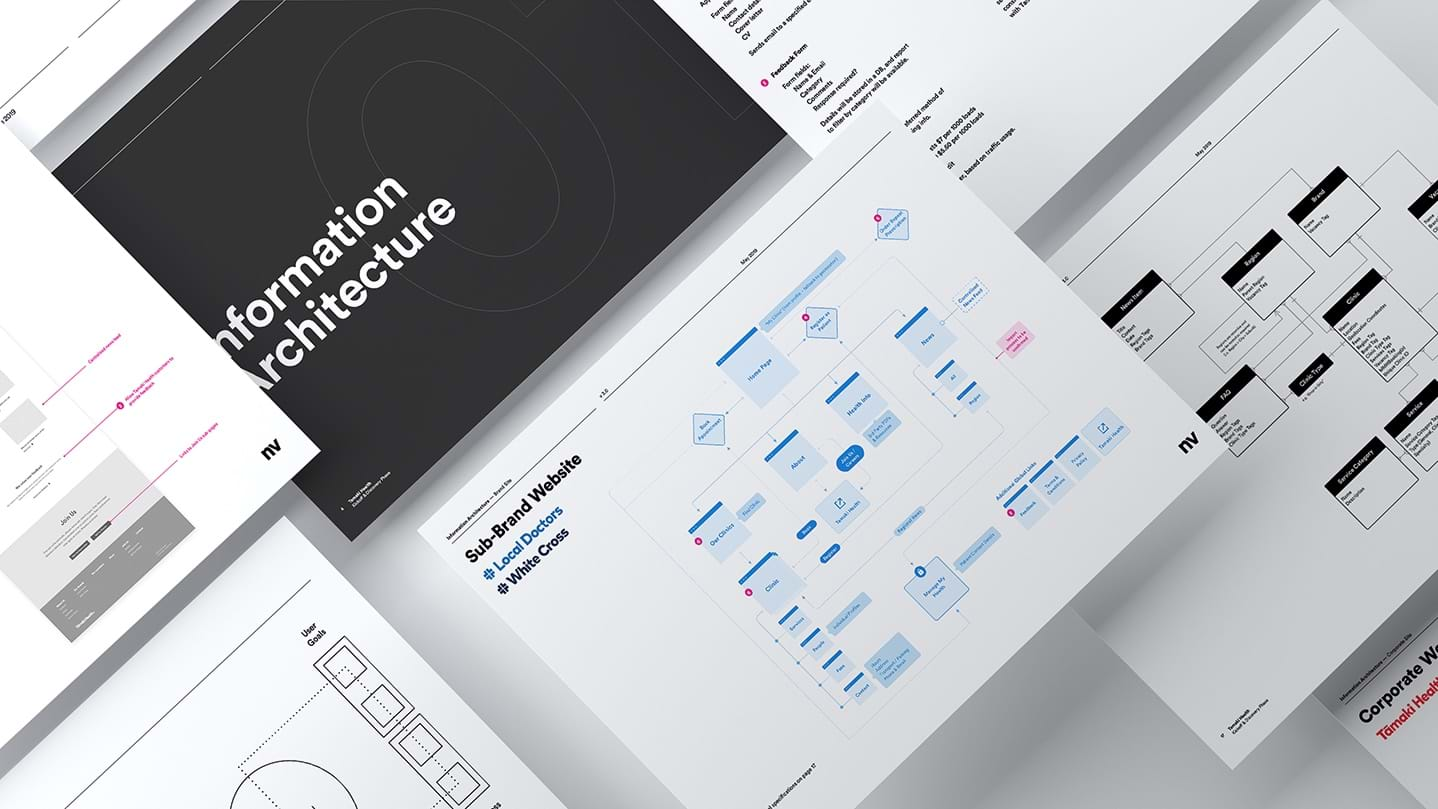
Using UI Elements to Harmonize the Cross-Brand Experience
As the project included three brands, a design direction was needed to achieve individual brand distinction whilst maintaining an overarching sense of visual coherence. We used a combination of UI element style consistency and varying colour palettes as a means of establishing a successful visual system that helped create an optimal cross-brand user experience.
Key website features
The project demanded a set of websites that went beyond just looking good — they needed to work hard.
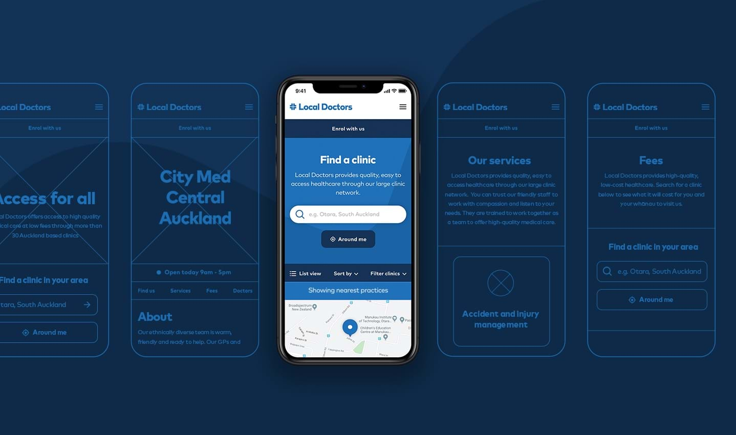
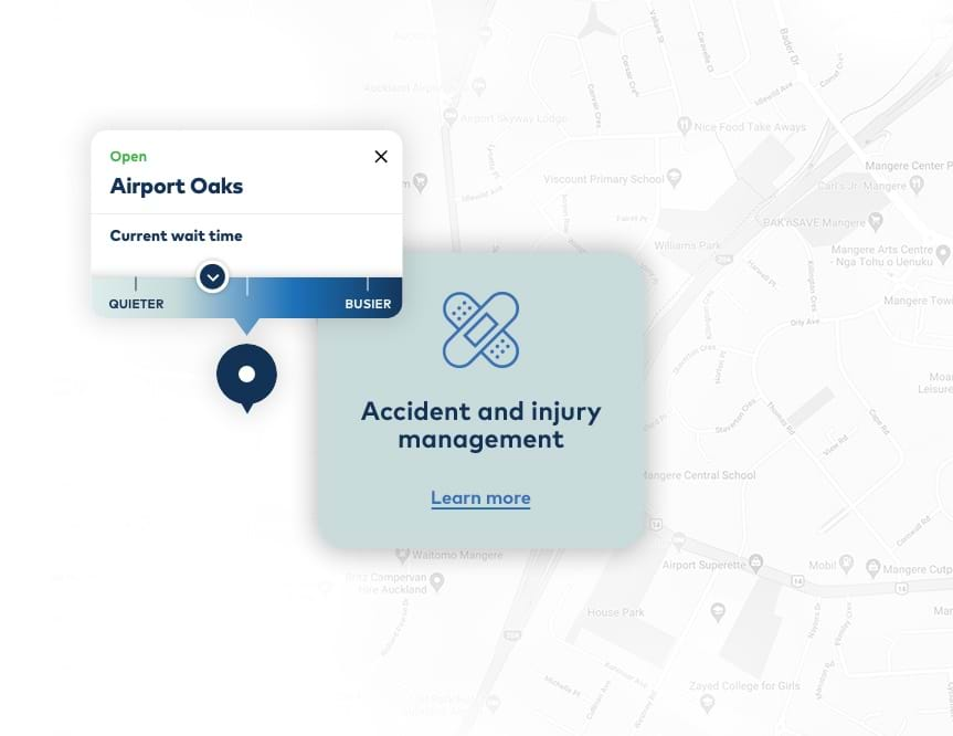
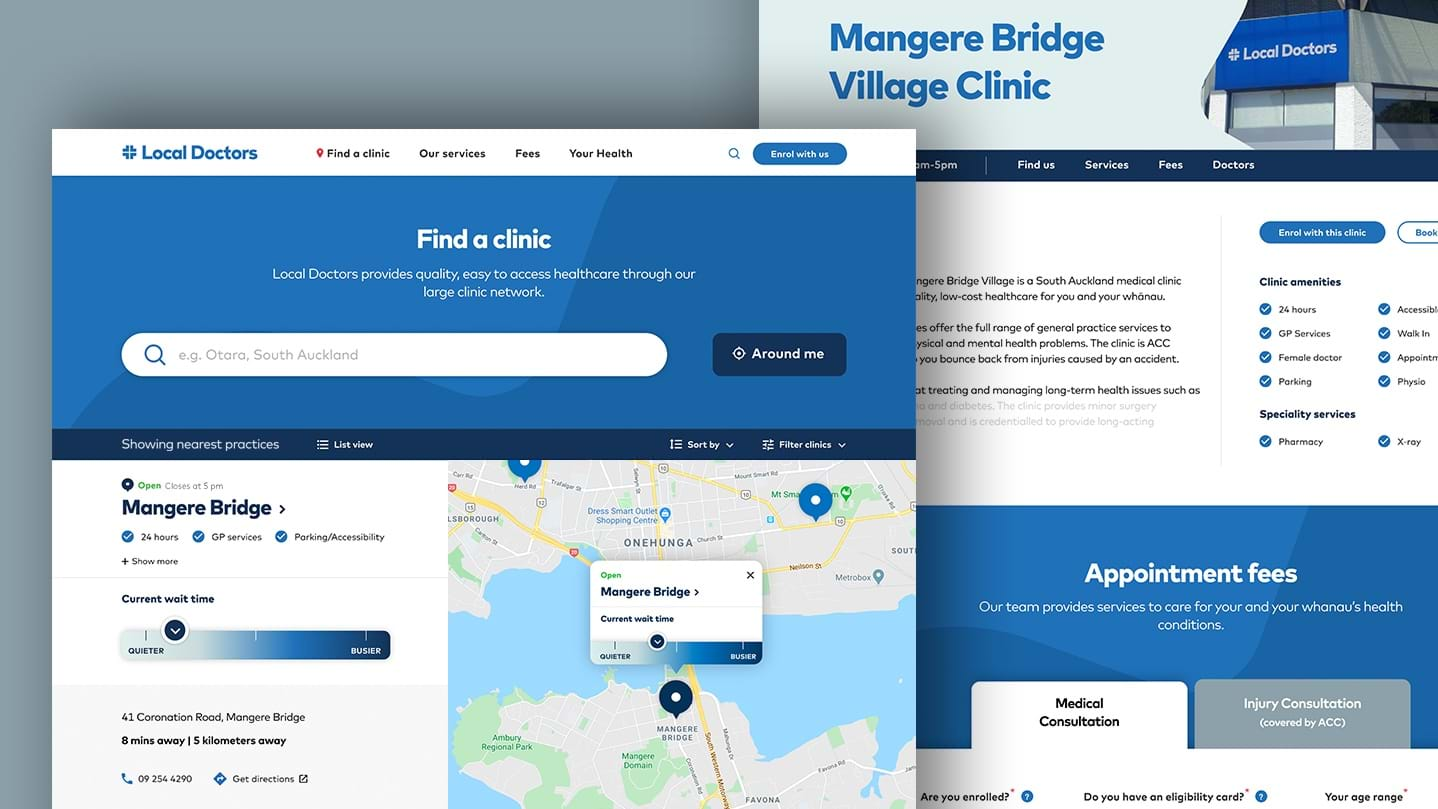
We implemented a number of core features to help direct users to the nearest and most suitable practice location where waiting time was down. This was to ensure the best possible patient experience, particularly in the event of an emergency.
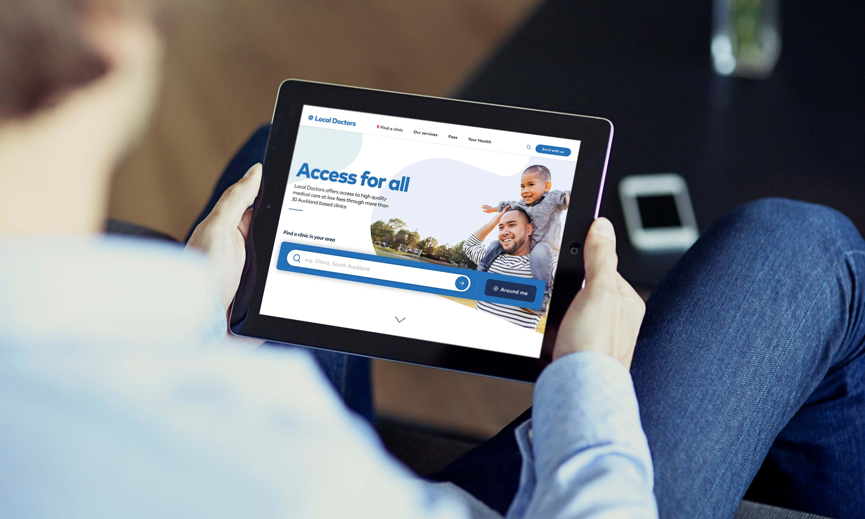
Core features included live practice wait times and travel distance data, an intuitive clinic search function with filtering options to refine patient preferences, and an online enrollment form, allowing users to complete the sign-up process without visiting a clinic.
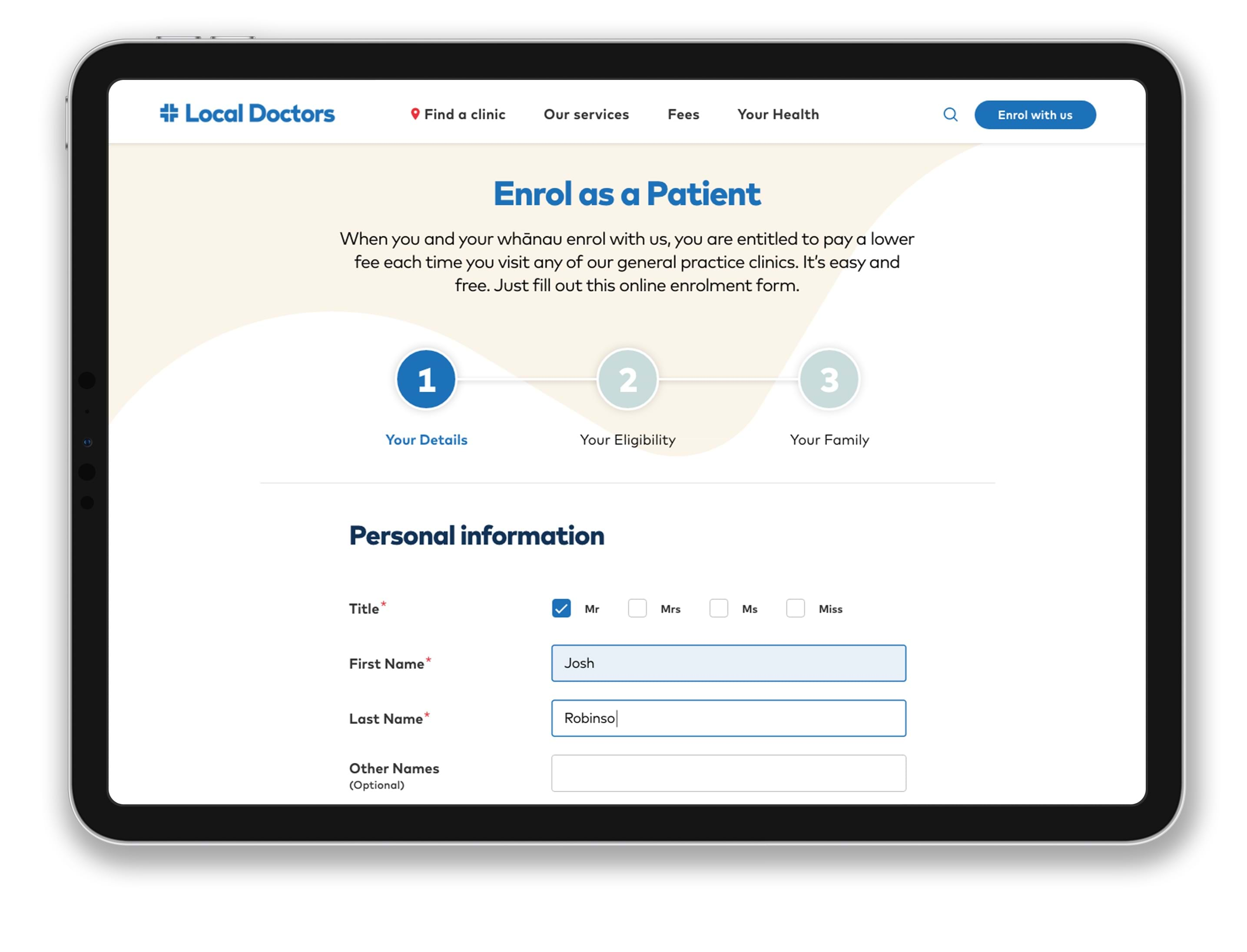
Introducing Patient Online Enrollment Capabilities
In moving away from the paper-only approach to patient sign-up, enabling online enrollments was a key feature to achieve the objective of acquiring an increase in new patients. The form needed to be intuitive with a painless experience across devices – particularly given the percentage of low literacy patients in the target demographic.
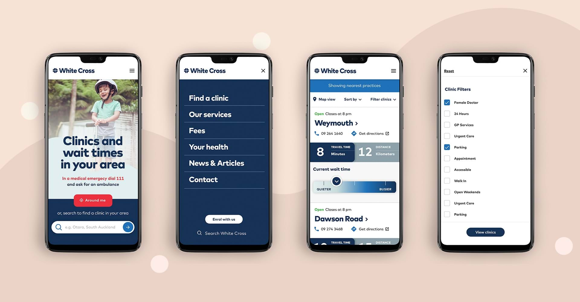
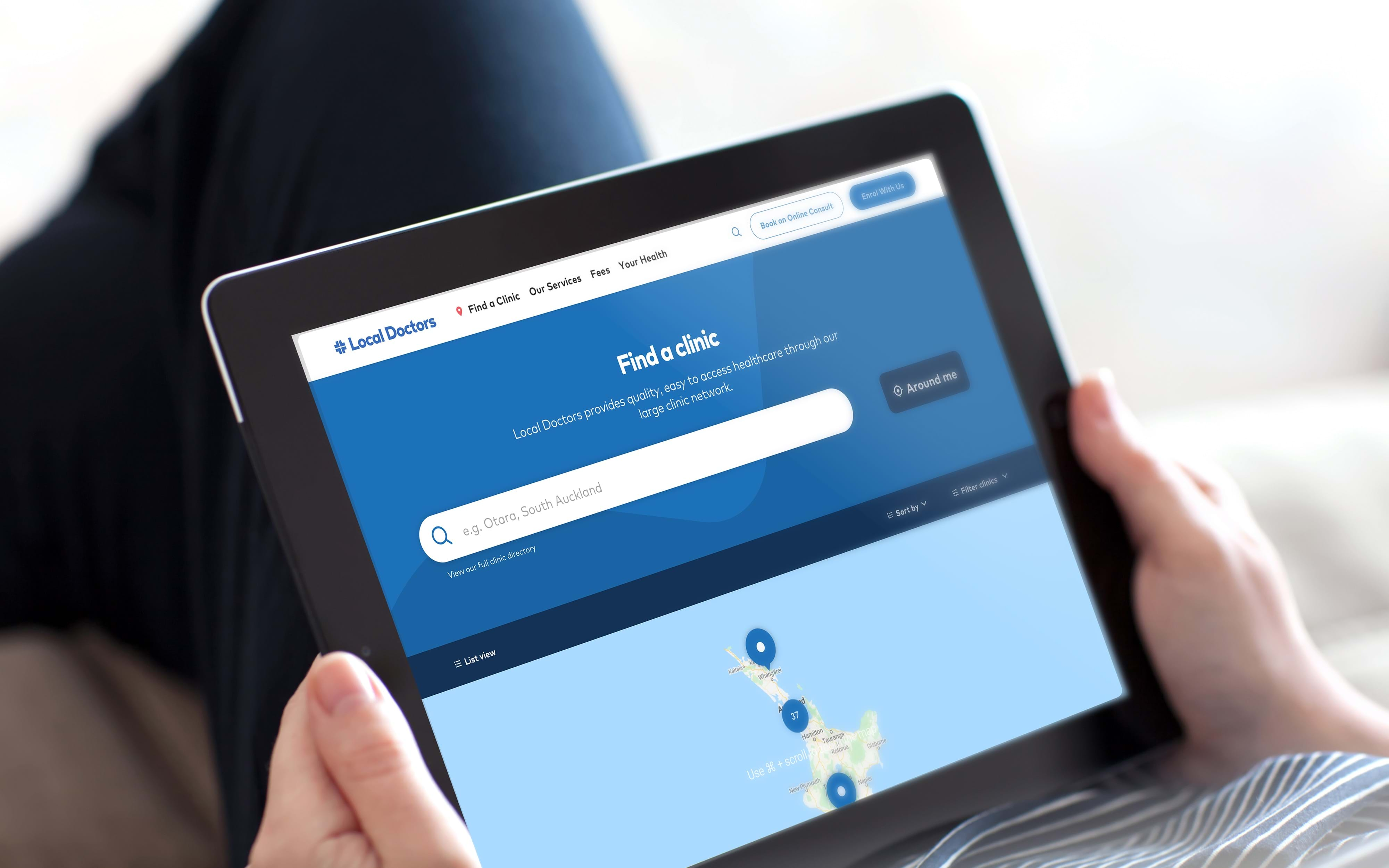
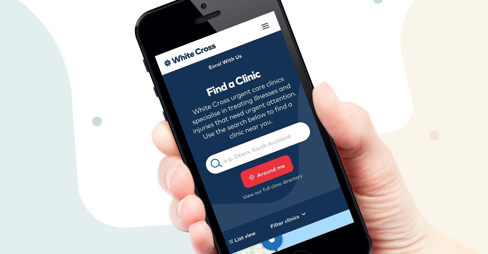
Providing a Mobile Optimised User Experience
Audience research suggested mobile devices were used as a primary method of seeking the client’s healthcare services. In order to provide an engaging user-centric market leading experience, we needed to make sure mobile design was given some serious consideration across all stages of design.
Clear, simple and engaging design choices
The usability needs of the target audience called for design choices that resulted in intuitive user paths and easily digestible information — allowing people to arrive at what they were looking for quickly and without fuss.
To meet this creative brief, the visual direction of all three websites purposely avoided anything visually complicated or intricate. We achieved a degree of comfort and simplicity through design by using various rounded elements and a sympathetic colour palette.